Chromatic Studios Logo Chromatic Studios Get Started
Menu
Get Started
Advanced 15 min read July 2026

Building Accessible Multi-Theme Systems

Create theme switchers that work for everyone. We'll show you how to ensure your dark mode and light mode implementations meet WCAG accessibility standards while delivering excellent user experiences across all vision capabilities.

Why Accessibility Matters in Theme Design

Theme switchers aren't just about aesthetics. They're about ensuring your site works for everyone — including people with low vision, color blindness, light sensitivity, and various other needs. When you build accessible themes, you're expanding your audience and improving the experience for all users.

The challenge? Creating themes that don't just look good, but meet contrast requirements, handle focus states properly, and respect user preferences at the system level. It's more complex than flipping colors around.

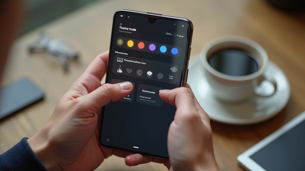
Mobile phone displaying app interface with multiple theme color schemes and selection options visible on screen
01

Understanding WCAG Contrast Requirements

WCAG 2.1 specifies minimum contrast ratios for text and interactive elements. For normal text, you need 4.5:1 contrast between foreground and background. Large text (18pt+) requires 3:1. This isn't optional if you want to serve users with low vision.

The tricky part? Your light theme might pass 4.5:1 easily with dark text on white backgrounds. But your dark theme with pale gray text on dark backgrounds might fall short. You've got to test both directions. Use tools like WebAIM's contrast checker — input your actual hex values and verify both themes meet the requirement.

Don't guess. Test every text color against its background. And remember — this applies to buttons, links, placeholders, everything that conveys meaning through color.

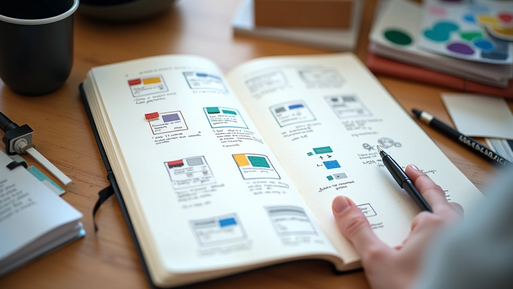
Designer working at laptop with contrast checker tool open, testing color combinations for dark and light theme palettes
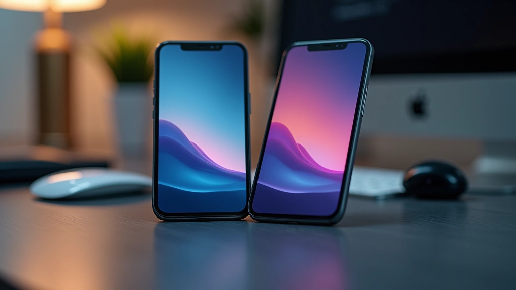
Two smartphone screens side by side showing the same interface rendered in deuteranopia and protanopia color simulation filters
02

Designing for Color Blindness

About 1 in 12 men and 1 in 200 women have some form of color blindness. The most common types are red-green color blindness (deuteranopia and protanopia). If your theme relies solely on color to convey information, you're excluding these users.

Your theme switcher button shouldn't say "Light mode" in blue and "Dark mode" in orange. That won't work for colorblind users. Instead, use text labels, icons, and sufficient contrast. Test your themes with colorblind simulation tools — Coblis and Color Oracle are free options that'll show you exactly what your site looks like to different types of colorblind vision.

The payoff? Themes that work for everyone, not just people with typical color vision. And honestly, the improved contrast and clearer labeling benefits all your users.

03

Respecting System Preferences and Reduce Motion

Users often set their OS to dark mode for a reason — maybe reduced eye strain, maybe personal preference, maybe a vision impairment. Your site shouldn't force them to switch themes if you can help it. That's where `prefers-color-scheme` comes in.

When a user has dark mode enabled in their OS settings, your CSS media query picks it up and applies your dark theme automatically. They get the experience they chose without lifting a finger. You still offer a manual toggle for those who want it, but you're respecting their system preference first.

Similarly, `prefers-reduced-motion` tells you when a user has asked for less animation. If you're animating theme transitions with fades or slides, disable those animations for users with vestibular disorders. It's a simple check that prevents motion sickness and makes your site more inclusive.

MacBook display showing system settings panel with dark mode toggle and accessibility options highlighted

Practical Implementation Checklist

1

Test Contrast Ratios

Use WebAIM's contrast checker or Contrast Ratio tool. Test text, buttons, and interactive elements in both light and dark themes. Aim for WCAG AA (4.5:1) minimum, AAA (7:1) is better.

2

Simulate Color Blindness

Run your themes through Coblis or Color Oracle. Check that information conveyed by color alone has text or icon backups. Don't rely on "red means error, green means success."

3

Implement prefers-color-scheme

Add media queries to detect user's OS theme preference. Apply your dark theme when `prefers-color-scheme: dark` is detected. Let users override with a manual toggle if needed.

4

Respect Reduced Motion

Use `prefers-reduced-motion` to disable animations for users who've enabled it in their OS. Theme transitions should be instant or very subtle for these users.

5

Test Focus States

Keyboard users need visible focus indicators. Make sure your theme switcher button has a clear focus outline in both light and dark modes. Test with keyboard navigation.

6

Use Semantic HTML

Your theme switcher should be a proper button or link. Use role="switch" if appropriate. Screen reader users need to understand what the control does.

Making Accessibility the Default

Building accessible multi-theme systems isn't an afterthought. It's a core design decision that shapes everything from your color palette to your interaction patterns. When you prioritize accessibility from the start, you end up with themes that work better for everyone.

The good news? The tools and techniques are straightforward. Test contrast, respect system preferences, consider color blindness, and handle motion carefully. These steps take time upfront, but they prevent problems later and show your users you care about their experience.

Start with contrast testing this week. Run your current themes through WebAIM's checker. If you find failures, that's your roadmap for improvement. Small fixes now prevent accessibility complaints and lawsuits later. Plus, you'll sleep better knowing your site actually works for people with different vision capabilities.

Educational Information

This guide is intended for educational purposes. WCAG standards and accessibility guidelines are regularly updated. Always consult the latest WCAG documentation and test your implementations thoroughly with real users and assistive technologies. Accessibility requirements may vary by jurisdiction and industry. Consider consulting with accessibility specialists for specific compliance needs.