

CSS Variables for Dynamic Theme Switching
Discover how CSS custom properties make managing multiple themes simple and maintainable across your entire application.
Learn how to build a dark mode toggle that persists user preferences and handles system-level theme detection automatically.

Dark mode isn't just trendy anymore — it's a must-have feature. Users expect it. Their eyes appreciate it, especially at night. And honestly, it's easier to implement than you'd think if you know the right approach.
We're going to walk through a practical implementation that handles three key things: persisting user preferences, detecting system theme settings, and toggling between modes without breaking your existing styles.

Start with React Context. You'll create a theme provider that wraps your app and makes dark mode available everywhere. This is the foundation — without it, you're passing props down five levels deep, which nobody wants to do.
Your context should track the current theme (light or dark) and provide a toggle function. Simple. The provider reads from localStorage on mount, so when users come back, their preference is already there waiting for them.


Don't assume light mode is the default. Check what the user's operating system prefers using the `prefers-color-scheme` media query. You can do this in CSS or JavaScript — JavaScript is more flexible for React.
Use `window.matchMedia('(prefers-color-scheme: dark)')` to detect system settings. It returns true if dark mode is enabled on their device. Then listen for changes with `addListener()` so if they switch system themes, your app updates automatically.
This respects user intent. If someone set their whole computer to dark mode, your app shouldn't force them into light mode on first visit.
When someone clicks the toggle button, save their choice. localStorage is your friend here. Store a simple string — "light" or "dark" — and read it back when the component mounts.
The key decision: what's the priority order? Most apps do this: if the user explicitly set a preference, use that. If not, check system settings. If system settings aren't available, default to light. That three-tier approach covers basically everyone.
Pro tip: Set the theme on the document root element (like `document.documentElement.setAttribute('data-theme', 'dark')`). Then your CSS can use attribute selectors. No class juggling, no flash of wrong theme on page load.


Here's where it gets clean. Use CSS custom properties instead of managing separate stylesheets. Define your colors as variables — `--color-background`, `--color-text`, `--color-primary` — and switch them based on a data attribute.
Your CSS would look something like this: light mode colors in the default state, then override them when `data-theme="dark"` is set. This way, you're not rewriting classes or duplicating selectors. Just swap the variable values.
The benefit? Consistency. Every component uses the same variables, so switching themes is instant and uniform across your entire app. No random colors staying light while others go dark.
The worst user experience is when a page loads in light mode then switches to dark. Prevent this by reading the theme preference before rendering. Use a script in your HTML head that sets the data attribute immediately.
Don't just pick colors because they look nice. Dark mode text needs proper contrast too. Aim for 4.5:1 for normal text, 3:1 for larger text. Use tools like WebAIM's contrast checker to verify.
Images don't change with theme. Sometimes a light background in a photo looks weird on a dark page. Consider adding subtle borders, slight overlays, or even alternative versions for dark mode on critical images.
CSS variables are supported everywhere now, but localStorage behavior varies slightly. Test on the browsers your users actually use. Mobile browsers handle dark mode differently than desktop.
Dark mode in React doesn't require a massive library or complicated setup. Context + localStorage + CSS variables = a solid, maintainable solution. You're respecting user preferences, handling system settings, and keeping your code clean.
Start with the Context approach we outlined. Get localStorage working. Then gradually replace your hardcoded colors with CSS variables. You don't need to do it all at once — refactor piece by piece, and your app will be smoother for it.
The result? Users get a theme that matches their system, stays consistent, and persists across sessions. That's a feature worth implementing well.
This guide provides educational information about dark mode implementation patterns and React best practices. Code examples and approaches reflect common industry patterns as of 2026. Browser compatibility, accessibility requirements, and user preference handling standards may evolve. Always test implementations thoroughly in your specific environment and consider your application's unique requirements. Consult official React documentation and accessibility guidelines (WCAG) for the most current recommendations.

Editorial Team
Written by the Chromatic Studios Editorial Team, focused on practical, tested guidance for theme switching and dark mode implementation.
Discover how CSS custom properties make managing multiple themes simple and maintainable across your entire application.
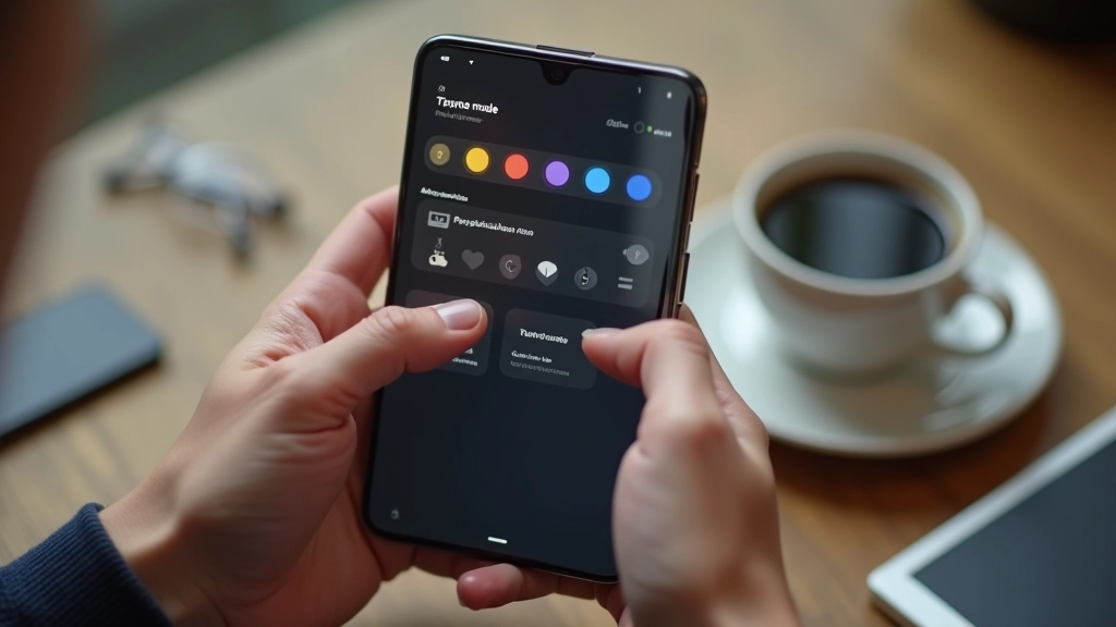
Ensure your theme switcher meets accessibility standards while providing excellent experience for all users.

Master the fundamentals of design tokens to create scalable, consistent, and flexible theme systems.